I’ve just attempted to set up a cover picture for one of my puzzles to see what the feature would be like.
I’m a bit disappointed.
The interface recommends we prepared a 1920×1080 picture. Which I did.
While importing it, it helpfully suggests I crop it. Which I don’t want, since I just cropped and scaled it appropriately! Unfortunately, the interface by default selects a smaller part of it, so I have to correct it back to the full thing. Using the handles with a mouse on a scaled-down version of it, with no useful/visible clamping, so I’m probably losing some pixels here
And in the end… the interface won’t even display the whole of it! So I end up with a useful part of it out of view.
Would it please be possible to:
better specify the actual expected image size? Which can remain 1920×1080 if you think there are places where the whole of it is displayed, but at least then also define the “useful” area of it!
indeed, we should select the right dimensions by default.
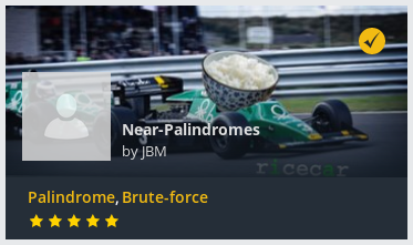
When you say that the interface doesn’t display the entire picture, you’re talking about the puzzle page right? The 1920*1080 format serves the display of the puzzle as a tile in the list of puzzles. The picture on the puzzle page will always appear differently. We don’t stretch the picture but we make it fit to 100% of the width; hence you lose quite some part along the height of it.
Ok so this seems to be the extents of what can be visible.
My best suggestion is a simple: change the current design! There’s no reason you couldn’t spread the tiles out responsively while keeping them clamped to a specific aspect ratio.
Failing that: provide us (hey, you can use it too, it would actually help you too) with a standard PNG template that clearly delineates which zones are always visible, and which are less reliable.