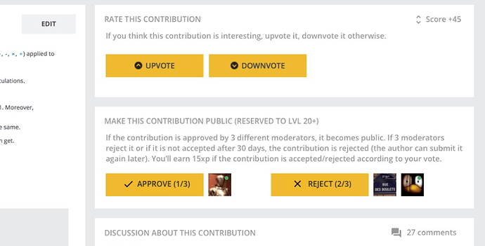
How about the currently pending contributions? Are they subject to any time limit of 30 days?
I knew I had forgotten something, thanks!
Their timer has been set to 30 days starting today.
Why not resetting the counter if the contribution gets a +1 or a validation?
What is the current sorting order on the pending contributions list page? The sorting orders are different for “All” and “Puzzles” (the order seems to be the same for “All” and “Clash of Code” though).
Is there any way to sort the puzzles by “last updated” e.g. adding sort-by as part of the url? (Even better if the sorting order can be made as a pull-down menu but I may be too greedy  )
)
Also is it possible to show the acceptance/rejection status (as suggested here: Vision for Community Puzzles - 1.5 years later) on the pending contributions list page? To me, I’m not really interested in the number of views; I don’t know what others think.
Well, resetting the counter has its downsides too.
We believe that in the majority of times, 1 month should be enough.
Seems very short now that we have a long list, but when the list will be 10 items long, it should be ok.
We could change our opinion and modify this behavior if we’re not happy with the results. Let’s see.
@Chingmann the sorting is the following: smallest counter first = the most “urgent” contrib to look at. As they all have the same, it’s a bit random now. Wait one month 
We’re actually working on it, as part of bringing game contributions to the contribution section. And here is a quick mock-up:
I’m all for clearing the junk, but I do fear this will push towards either easier puzzles or sloppier editing. Maybe both.
The change you described is nice, but for both features I’d like to see, I’m referring to the page where all the pending contributions are listed, not on the individual contribution pages 
(a) Sort by “last updated” (I hope at least the sorting behaviour is consistent when different filters (All / Clash of Code / Puzzles) are applied).
(b) Show acceptance/rejection status in addition to/instead of number of views
EDIT: Also, the pending contributions listing page and individual contribution pages show incorrect number of comments. Perhaps deleted/edited comments are counted?
a) Maybe we don’t need more sorting if there aren’t that many contributions to sort.
b) yes, we want to do that too.
EDIT: I’ll look into the bug of incorrect number of comments. Thanks @chingmann (I delete your comment below then  )
)
More specifically, from 1 May 2018,
- How many have approved/rejected more than 1 community puzzle?
- How many have approved/rejected more than 1 clash of code?
Just curious 
Just to clarify, there are now more than 1400 contributors with level >= 20.
Hi,
I like the artistic touch in the standard challenges presented under the link “Practice” in the main page. We can find few puzzles and tasks well illustrated and having tests, I really enjoyed solving them from time to time because it’s beautiful, clear and instructive.
But those days, and after returning from a long period of absence, I found the “Standard” Practice Challenges crowded with players or community puzzles not having a good visual design and adding noise to the old puzzles. In the past, I showed the site to a friend and he appreciated the old list of games with their graphics and animated tests, but yesterday, when I showed it again to another friend he noticed that it’s so noisy and crowded as if it’s an amateur forum or exchange list.
I assume perhaps you are trying to promote players contributions by putting them at the same level of the standard challenges, but in my point of view, it did add creepiness to the old enjoyable list. Maybe you can put them in an other tab in order to preserve the beautiful graphic style in the already exiting puzzles.
Best Regards.
Thanks for the feedback. I would love to discuss with the community to find the best solution about this problem.
Here are the solutions I have in mind:
- allow contributors to add a dedicated cover for their game
- add a separator to separate Codingame and community games in the page.
Our goal is that the community gains more and more power on the platform so that we feel that the platform has a strong and active community. This is why I personally don’t like that we separate too much content created by the community and the ones created by CodinGame. But we also need to maintain a high quality feeling on the platform.
So I would love to hear anyone about this. What do you think and what do you suggest?
I would like both of these to be implemented.
“allow contributors to add a dedicated cover for their game”
I do not need a dedicated cover - I am not a painter or artist who could do good drawings.
I just need the option to insert a diagram to better explain the puzzle
Since the community puzzles are separated by difficulty categories, don’t they have to grand different amount of experience based in which category they fall, like the classical puzzles. You can get between 500 and 750 exp from very hard classical puzzle but from community very hard puzzle only 50.
I’m terribly sorry for the late answer, I prefer to separate the community games in third tab in addition to the “Puzzles” and “Sponsored Puzzles” tabs. And at the same time, pic a community challenge and do the necessary design and animated tests to make it look like the Real CG Challenge.
Thanks in Advance.
