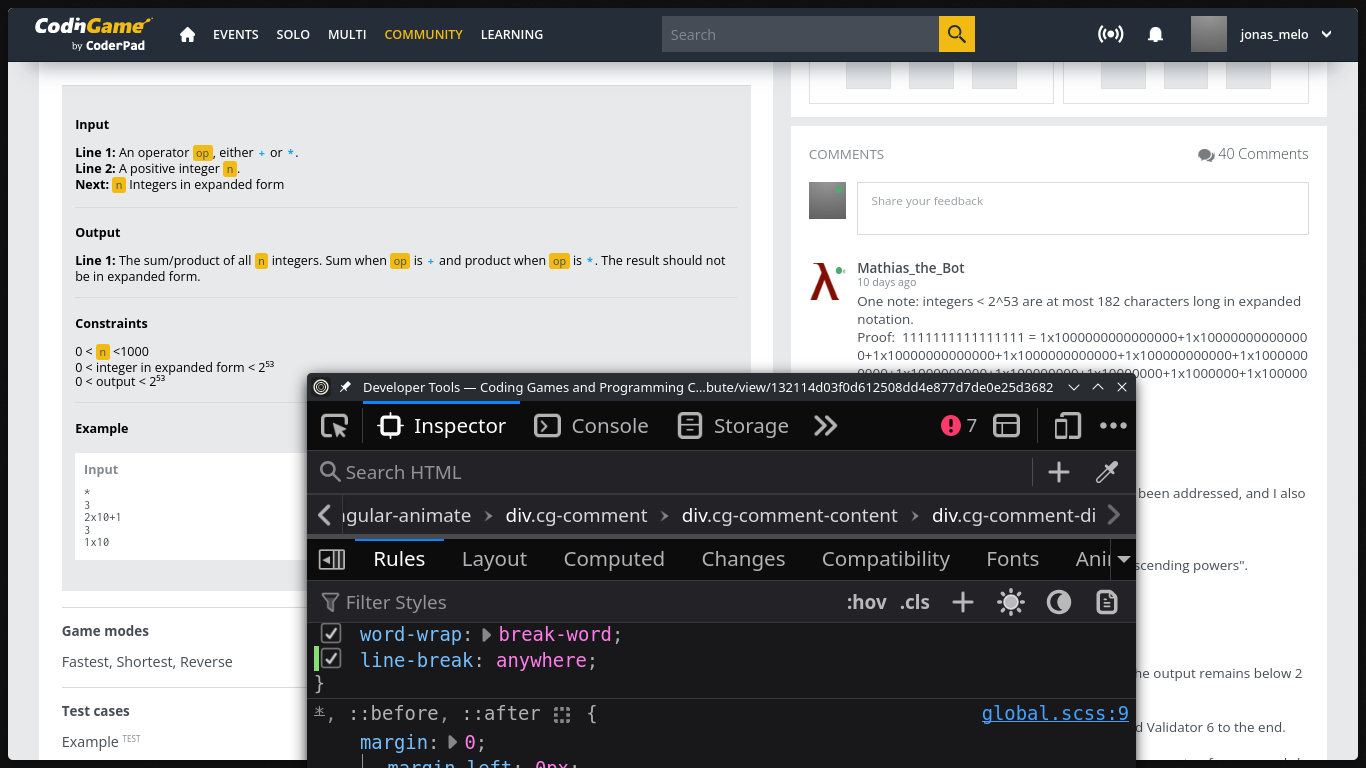
Currently, if someone sends a large chunk of text with no spaces in it, the contribution page’s layout goes to mobile mode in desktop, changing the page’s container grid to 1 column.
Here we can see that the top comment of @Mathias_the_Bot is so long that it breaks the layout. You even need to scroll the whole page horizontally to see the end of the comment.

I could fix it by adding the following CSS rule to comment containers (.cg-comment-content).
line-break: anywhere;
Link of the screenshot’s contribution: Coding Games and Programming Challenges to Code Better