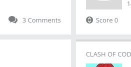
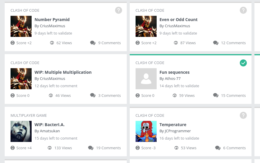
The contribution cards or containers in the Community Contributions Page are not aligned correctly.
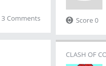
That’s because the contribution container element is using border-top to indicate the status. Using a border at the top “pushes” the container down so the border can fit, making the container bigger than others that don’t have a status bar.
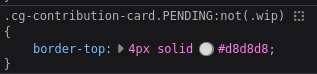
One solution would be using the pseudo-element before, turning this status bar into a floating bar and position it at the top of the container like this:
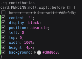
This fixes the problem while respecting the original’s width, height and background colors. As you can see in the second line in the screenshot, these rules are only affecting .PENDING elements. Applying the same rules to other status, like .APPROVED, fix them as well.