New UI! What do you think?

Hi,

This is the place where you can express your feedback regarding the new UI and new menu.
So far I gathered the following:

  • chat is greyish -> true. I guess we need to get used to it.

  • on mobile, top and down bars take a lot of place

Don’t hesitate!

1 Like

I know there is a good reason for it, but I really miss the buttons (for instance on top of the puzzle section) to filter the categories.

Otherwise, I find the new interface a bit faster and cleaner :slight_smile: Good job !

2 Likes

+1 to that.

I like that the FAQ and Blog are elevated (always available on every screen) in the new interface, but I question the choice of less visibility for the Forum. I suppose it’s probably fine, especially since it’s also available from each of the puzzle screens.

  • danBhentschel

Dismissing a single notification now hides the whole notification list. That makes it very inconvenient to quickly dismiss a subset of them.

What is it?

Yeah I noticed this bug yesterday

I agree, I find the blog & forum buttons very hidden. It may be promoted to contribute section maybe. I know each puzzle has a forum button, but still.
*Edited now I do see the top menu on forum

If we move the forum as a tab in the contribute page, will it fix the problem for you?

Personally, since the community is very important on a site like this… I think both the forum and the blog deserve their own button accessible quickly anytime, just like the chat is always on the side. Even under contribute would still be too hidden.

1 Like

I share the opinion, that the forum is a bit hidden. For the blog I don’t see a problem, as we get notifications about new posts containing a direct link.

I liked the menu on the left side. I have a 2560*1440 Monitor, which looks quite empty now.
You used to show 5 columns of community puzzle suggestions (maybe more, if I had a bigger screen), now there are at most 3 and big white edges.

Can you confirm 3 Puzzles in a row ? It should be 4.

Chromium under Ubuntu16.04 / i3wm:

edit: under accepted (community-)puzzles, there are four in a row, but still a lot of unused space.

After a few days, I have to say I strongly dislike the new layout, mainly for a simple reason.

I only have a 14" screen in 16:9 format, the top menu takes up a huge space on my screen.

The old layout made a much better use of screen space than the current layout.

Things get even worse in sub-menus. Look at the joke the leaderboard becomes :

For real ? Why can I only see two people in that leaderboard ? :frowning:

Other than that, in no particular order :

  • Why in hell is the chat font color such an ugly grey ? Once again, think about crap-quality-laptop-monitors… My screen has no contrast and the text is hard to read.
  • Forum accessible in one click please ?
2 Likes

Can CodinGame team members make comments too? :slight_smile:

Like others I find the chat hard to read now (either because of the color, or the font which has a very light weight or my screen which has a bad contrast, or my poor vision). Whatever the reason, it would be great if the legibility could be improved.

1 Like

For those who are inconvenienced with the chat, you may wait to use the following CSS in any CSS extension such as “Stylish” for Chrome :

.message-text-content {
color: #000000 !important;}

(hehe, Codingame is a great learning tool ! I had to learn basic CSS for this :D)

1 Like

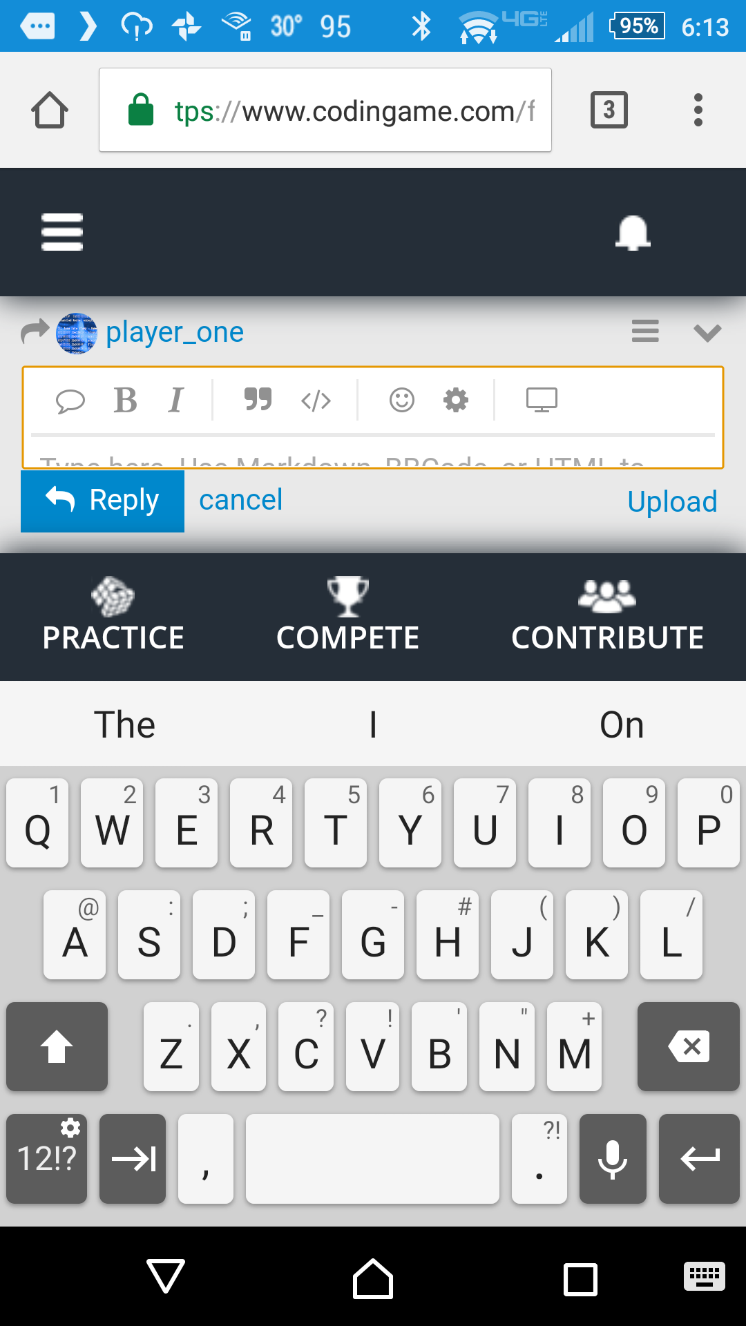
An additional tidbit: it’s practically impossible for me to post on the forum in Android now. With my phone’s keyboard on the screen, the extra horizontal bars make the text area laughably small. It was never great before, but it was usable. Now it’s terrible.

  • danBhentschel

Thanks for your feedback.

Based on it, here are some fixes we will release soon:

  • darker text color in the chat
  • remove of the footer on mobile

This is solved.